Monday 30 September 2013
Tuesday 24 September 2013
13. ident analysis
 This e4 ident is completely random however that is because it is to interest the viewers that are 16-34 year olds, like all idents it includes the logo in some of the shots for example like in the photo the logo is slowly made on the wall as all the other objects around it are moving as well, also focusing on the logo you can see that the logo is in the classic E4 color which is a certain shade of purple this is so that people recognize the logo as E4 because of the color, there is also alot of other objects in this color, the song used is a mystical sounding song this is used to open shows and so when people here it they will know a show is coming on, there are almost alot of sound effects for example small robots shooting rockets, the camera is panning across getting all shots as they diverse into different objects, the camera also pull out shots as it slowly moves out of the object, the whole video is animated. This ident may not be attractive for all ages as the ident is quite child like as it includes toys and sweets therefore this may not appeal to an older audience this is negative as they will not reach as many views on the channel.
http://www.youtube.com/watch?v=hOw4i-UB8Lw
 This ident is completely random also and has nothing to do with the channel it is advertising, as it is just dogs running in a circle formation howver the dogs running in a circle represent bbc one as there are running in the formation of the logo as it is in a circle which is the face of bbc 1 so people would recognize it as the bbc and in the middle of the circle it uses the bbc logo as-well, is also uses the corporate identity theory as it uses the color red which people would situate with bbc one as it is the color used most commonly in there channel, the song used is a simple light melody with no lyrics, the camera shot is a close up to the dog jumping the flaming hoop to interest the audience which is a target of everyone therefore the ident is there to entertain people of all ages. This ident may not be attractive for all ages as some people don't like animals or dogs and some people may even be allergic therefore putting them off the channel and not getting as many views this results in that being a negative prospect of the ident.
http://www.youtube.com/watch?v=LB-REla0Sgc
 This ident is random to the channel it advertises however it uses bright colors that intrest the target audence of young children, the ident is animated and and uses camera shots where it is just still and filming in-front of it, there is no song in the ident only sound effect which are childish, to intrigue the audience, the ident uses the cooperate identity theory by using its common oragne colour with the logo this is so people recognize the logo as nickelodeon when they see it, the ident itelf has no relevene to anything but it is just there to entertain the audience which is children, the ident itself is animated as most of the shows are animated, and an animated ident is fit to more of a younger audience. This ident may not be attractive for all ages as the ident is quite childlike as it includes cartoons and bright colours therefore appealing to more of a younger audience this can put off an older audience therefore not getting as many views as they could have.
http://www.youtube.com/watch?v=0Q-nkaiY5GM&safe=active
Friday 20 September 2013
James Frost directors task

James Frost began his career in 1997 as part of the British directing duo James & Alex [Smith]. The pair produced work together starting at the Artists Company, and lat
er at Ridley Scott Associates (RSA Films). The pair stopped working together in 2001 with Turin Brakes "72" being the last video they created together.
In 2004 Frost started Blip Boutique. Successful collaborations have since been created under the Blip Boutique banner including work with The White Stripes, Elvis Costello, OK Go, Phish and Robyn and a video for Interpol using data visualization in collaboration with data visualizer and artist Aaron Koblin along with Frost's creative partner at Blip Boutique Mary Fagot. Blip Boutique has since moved more into the world of Interactive digital media and social network applications.
His 2008 "House of Cards" video for Radiohead, with technological assistance by Aaron Koblin, premiered on Google. No actual camera footage is used in the video; instead, it used LIDAR technology similar to that used in Google Maps. The video was made with assistance by students of the G-Star School Of The Arts, and was nominated at the 51st Grammy Awards for Best Short Form Music Video in 2009.
 Although Frost has been directing for a number of years, his innovative work with Radiohead on House of Cards garnered him a position in the 2009 Saatchi & Saatchi Showcase in Cannes.
In 2010 James Frost collaborated with the rock band OK Go and engineering collective Syyn Labs to create a giant Rube Goldbergmachine for a music video for the song "This Too Shall Pass". The video took 5 months to design and build and two days to shoot. It was shot on February 11 and 12, 2010, in a warehouse in the Echo Park neighborhood of Los Angeles; the final version is one continuous take. It was released via YouTube on March 1, 2010 and by October 2010 had been seen 16 million times. The video was awarded the AICP award and is part of the permanent collection at the Museum of Modern Art (MoMA)in New York. From the songs that he has directed you can identify that he enjoys a sort of rock/indie type of music, and is it to interesting videos for example the OK GO song had a video that looked like it took ages to make and very hard to direct. The video's inspiration was from the band, who wanted "a giant machine that we dance with", a long-term aspiration of the band and inspired by other Rube Goldberg machines shown in videos on YouTube, including the interstitials used on the Japanese children's show, PythagoraSwitch. While they considered the idea of the machine for each song on Of the Colour, they opted to use "This Too Shall Pass" to make the end result "majestic and epic", even though it already duplicated the previous marching band video. They sought help through online science message boards, eventually coming in contact with Syyn Labs. From a pool of talent at a Syyn Labs-hosted "Mindshare LA" gathering, about 55 to 60 people from Syyn Labs, the California Institute of Technology (including some who work at the National Aeronautics and Space Administration's Jet Propulsion Laboratory and participated in the Mars Exploration Rover program, hence the model rover seen in the video) and MIT Media Lab helped to design and construct the machine. Damian Kulash's father (Damian Kulash Sr.) also participated in the machine's construction.
Thursday 19 September 2013
11. LOGO DEVELOPMENT


Tuesday 17 September 2013
music video genres
 Imagine Dragons-radio active, this video is an indie therefore the conventions include a very moody dark environment this is very common in most indie music videos, there is also the fact that there is some shots of the band playing there music this is also common in music videos, and is done to demonstrate that the band is talented and can play instruments as well as sing, there is also a story to this music video which again is common in indie style music, in this particular music video there is a random music video where there is a battle between stuffed animals which is quite random however there is also shots of the band, and it turns out they are trapped and are then saved.
 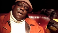 Notorious big- big poppa, this is a rap genre of music and will therefore have a certain set of conventions, such as: the lighting will be rather dark, and there will commonly have shots of a club with people dancing, also the main rapper will be surrounded by attractive women dressed inapproapitatly but to attract a male audience as-well as a female audience, there will also be shots of the rapper with expensive items such as a big house or a nice car to envy people, in most rap videos there will be shots of the artist with his shirt off to display muscle and attract a female audience and so men have something to aspire to.
 Wheatus-teenage dirtbag, this rock genre video has a common set of conventions in it which is found in most rock videos for example there is a lot of shots of the band and there instruments, this is done to show that the band have talent as well as singing and are not just famous for that, there is also a story behind some rock videos so that it is interesting to watch for example in this one there is a boy trying to win a girl for prom, the style is generally guitars and drums, and they will commonly be playing at a gig or concert.
 avincii-wake me up, this is a pop genre of music and is mostly played in the charts or on the radio, however the music video has a certain set of conventions that is found in most pop videos that link up, for example there is a large amount of shots of a big concert where the band will play, and there will be shots of people dancing and enjoying themselves, the colors are generally quite bright to intrigue a younger audience however it is listened to by all ages, there will generally be a story in the music video for example in this one it is them and how far they have come and them playing in a massive concert, there will also be alot of shots of the main artist singing, in this case avincii.
analysis of single camera techniques

The Big Bang Theory is a popular sit-com from america that uses single shot camera techniques to tell complex narratives, for example it would use a long single shot to get a better understanding of whats happening in the scene, for example in one scene they use sheldon waiting in a parking space and it is 1 take and he waits there for several minutes talking to himself.
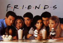
Friends is a popular sit-com from america, it is a very famous sit com, and would use single shots so that other people viewing it would get a better understanding of the programme and its longer therefore having a better explanation because it uses single shot camera techniques to tell complex narratives.
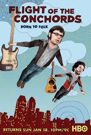
The Flight Of The Concords is a sit com and it uses many single shots to explain the story better to the audience, and would also sometimes have music videos is a popular sit-com from New Zealand that uses single shot camera techniques to tell complex narratives. for example in one show they do a music video where it contains many 1 shot takes.

This movie uses many single shot or single takes, this is because it is needed due to the long scenes it also help explain complicated scenes, as the film has a quite complicated story and is there for in need of single takes. for example in this film they use a very long shot when they are in the car and they a driving and they are attack and they then have to escape.

This film, Donnie Darko is a horror genre film and is filmed with many single takes to explain scenes that are hard to understand, for example a long shot will occur in a talking scene where an important discussion is being made. for example in this film they use a very long single shot in a scene where he is travelling back in time.

Is this horror genre film they use a lot of single shot takes to explain difficult scenes, for example in one scene there is a young girl moving the lawn with goes on about several minutes and it is all in one take this if to make it more realistic as it is at a point of view of the girl.

This music video is taken in one shot as it is needed as the activities going on are very complicated and it would not be as good if it was in separate shots, for example there is things that set of other things like a dominos that will chain react and turn on a light, it is all one tale.

This music video is very famous as it was all in one take and is very hard to get in one take as the story is so complicated, the video is them transferring from running machines and they are dancing on it and it would not be the same if it was in separate shots, it is all one take.

This music video is taken in one take, as it needs this because it is a complicated video and is need to have single takes to get the viewers a better understanding for example they used a one take shot when they are in the car playing the instruments, however they then switch it to a better point of veiw.
Wednesday 11 September 2013
9. Typography
 name of font: Greetoon
why chosen: I chose this font as it would appeal to young children as it is modern and exiting and would attract young children.
name of font: Ancient Geek
name of font: Gang wolflk
 Why chosen: I chose this font for modern as it is a future like font which shows like a modern style and people would relate this to a futuristic style of font.
 name of font: Monogram KK
why chosen: I think this font fits the title of sophisticated as it is neat and it has curls at the end of the letters which is neat and old fashioned.
 name of font: little snorlax
why chosen: I think this font links to art as it has artistic patterns inside the font therefore making it interesting and artistic.

name of font: Porn fashion
why chosen: I think this font fits the genre of fashion as it is the sort of font you would find on a jumper, making it what i think a fashion font.
name of font: alpha sport
 why chosen: I think this font fits the sport font as it has different sports for each letter therefore making it a sports font, and people could use it who do sports as they can relate to it and recognize it as a sports font.
 name of font: Nothing to loose
why chosen: I think this font could represent drama as it could be a horror drama show or a horror themed drama, as it is different and people would associate this with a horror drama.

why chosen: This font associates with comedy as it can be related to a comedy film or when people see it it gives a comical impact on them.
 name of font: tequilla sunrise
why chosen: I think this font symbols teenagers as it is modern and fun and teenagers could relate to it
Tuesday 10 September 2013
1. Channel Four And BBC Ident History
| |||||||||||||||||||||||||||||||


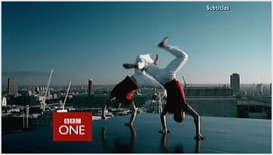
 2006-present day - After four years, the idents were replaced themselves by a new set introduced on 7 October 2006, abandoning the overtly red color scheme yet retaining the colour slightly less obviously as the main color. The relaunch brought about a new channel logo once more with the box replaced in favor of a lowercase name, effectively appearing as BBC One.
channel four


 1982-1992 - the first channel four ident was screened in 1982,The award winning Channel Four identity was designed in 1982 by Robinson Lamb-Nairn. They won the initial pitch against Michael Peters and Wolf Olins.
 From their initial presentation Lambie-Nairn researched Channel Four's philosophy and seized the fact that they would be buying all their programs in, so Channel Four would be a patchwork.
Their first idea was to illustrate the coming together of these elements. The first six ideas of 'coming together' all implied movement. One idea used the the colours of a television gun (RGB) and Channel Four liked the use of strong color and agreed the 'coming together' theme should be emphasised and developed further. they also make it so that it would link to a certain occasion for example in christmas they would add a christmas theme. they would also add themes such as sports themes which where added on 1984 and 1992 to celebrate different sports occasions such as the italian league they did a Italian football ident, they would also do idents to promote various programs such as, 'dinomania or atm comedy'.

1999 - they used this ident in 1999 they had various different colors to this ident, it was very basic however it included the new logo in white which we see today in channel four, it includes colors such as red, teal, purple and yellow to add a change to it.

2000-2013 - these are the most recent idents and the most modern they include the logo with a scene behind it for example in this photo there is a field of plants in this one, and in the most recent 2013 one there is the logo which is slowly made in different scene for example in this one it is a block of flats and bits of the flat combine to make the logo this makes the cannel more interesting and makes people want to watch it
Subscribe to:
Posts (Atom)